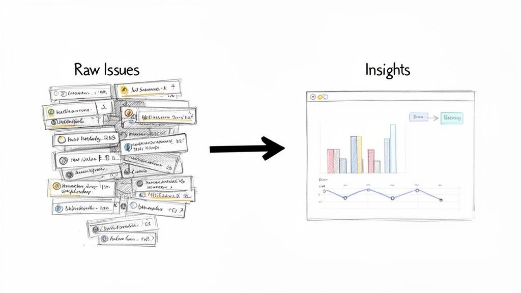
So, what exactly is Time in Status in Jira?
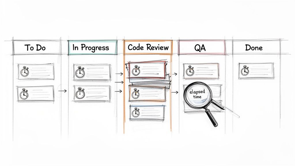
Put simply, it's the exact amount of time an issue hangs out in a specific stage of your workflow. Think 'In Progress,' 'Code Review,' or 'Waiting for QA.' It's a stopwatch for each step in your process, telling you precisely how long things actually take. This isn't guesswork; it's concrete data that shows you where work flies and where it gets stuck.
Why Tracking Time in Status Is a Game-Changer
We've all been there—sprints feel crunched, and deadlines keep slipping, but it’s hard to put a finger on exactly why. Hidden delays are often the culprit. A task might look like it’s moving along, but the real story is how much time it spends just sitting idle between active work.
Tracking time in status is the diagnostic tool you need to expose these hidden truths. It transforms that vague feeling of inefficiency into a clear, actionable insight. Is 'Code Review' the black hole where all tickets disappear? Do issues languish for days in 'Waiting for QA'? This one metric holds the answers.
This kind of visibility is powerful. It equips everyone, from Scrum Masters to Product Managers, to make smarter, system-level decisions. It’s not about watching people—it's about watching the process.
Uncovering Workflow Bottlenecks
The number one reason to track this metric is its uncanny ability to shine a spotlight on friction. When you discover that tickets consistently spend 70% of their lifecycle in a single status, you've just found your biggest opportunity for improvement.
A long time in status can point to a few common culprits:
- Resource Constraints: Maybe the QA team is overloaded, or only one senior engineer is available to approve pull requests.
- Clunky Handoffs: It could be that developers aren't providing the right info when they pass a ticket to testing, causing it to stall out.
- External Dependencies: You might find a task is stuck 'Waiting for Feedback' from a stakeholder who isn't part of the core team.
In fact, Atlassian’s own research found that teams can lose a staggering 25% of their time just looking for information. Time in status helps you see exactly where those information gaps and process snags are happening, so you can start reclaiming that lost productivity.
Actionable Insight: Time in status isn't a performance metric for individuals; it's a health check for your process. Use it to find and fix systemic problems, not to point fingers.
Making Data-Driven Decisions
With hard numbers on status timing, your conversations change dramatically. Instead of saying, "I feel like code reviews are taking forever," you can state, "The average time in 'Code Review' was 4.2 days last sprint, up from 2.8 days the sprint before." Now you have a real problem to solve.
This data-backed approach is what drives meaningful change. It’s a core component of any good developer time tracking software because it helps justify process improvements, argue for more resources, or adjust workflow rules with total confidence.
Here’s a quick breakdown of how this metric directly helps your team.
Core Benefits of Monitoring Time in Status
| Benefit | Impact on Your Team | Example Scenario |
|---|---|---|
| Pinpoint Bottlenecks | Identifies specific stages where work slows down or stops. | Issues consistently spend 5 days in 'Peer Review' before moving to QA. |
| Improve Predictability | Helps create more accurate sprint forecasts and project timelines. | Knowing the average cycle time allows for better estimation of future work. |
| Optimize Handoffs | Highlights friction between teams or roles, such as Dev to QA. | A long 'Ready for Deployment' status may signal a cumbersome release process. |
| Validate Process Changes | Measures the impact of workflow adjustments over time. | After simplifying the review process, 'Time in Review' drops by 40%. |
Ultimately, by understanding where time goes, you can focus your energy on the improvements that will have the biggest impact on your team's flow and output.
Using Jira's Built-In Reports for Status Tracking
You don't need a fancy Marketplace app to start finding answers. Jira already has powerful reporting tools baked right in. If you know where to look and how to read them, you can uncover the bottlenecks that are dragging your team down.
We're going to focus on two of the most valuable reports for analyzing time in status in Jira: the Control Chart and the Cumulative Flow Diagram. Think of them less as static charts and more as diagnostic tools—an X-ray of your team's workflow health.
Decoding the Control Chart
To understand the cycle time for individual tickets, start with the Control Chart. It shows exactly how long issues take to get from a starting point (like 'In Progress') to a finish line (like 'Done'). Its real power lies in spotting outliers and measuring the consistency of your workflow.
When you pull up a Control Chart, look for these key elements:
- The Blue Line (Rolling Average): A downward trend is your goal; it means your team is getting faster. If it trends up, it's time to investigate what's slowing you down.
- The Grey Area (Standard Deviation): This is your "normal" range. Most of your issues should fall within this zone.
- Outliers: Any dots floating high above that grey area demand attention. These tickets took too long and are perfect for a "what happened here?" investigation in your next retro.
Here’s what a typical Control Chart looks like, showing the cycle time for a batch of completed work.
See those few dots way above the shaded area? While most issues are clustered near the average, those outliers represent significant delays that are worth digging into.
Spotting Bottlenecks with the Cumulative Flow Diagram
While the Control Chart zooms in on individual issues, the Cumulative Flow Diagram (CFD) gives you the bird's-eye view of your entire workflow. It’s a stacked area chart where each colored band represents a different status.
The secret to reading a CFD is simple: watch the width of the bands.
Actionable Insight: If a band for a specific status starts getting wider over time, that’s your bottleneck. It means work is piling up in that stage faster than it’s leaving.
Imagine the 'In Review' band on your CFD starts to bulge. That’s a clear sign that your review process is overwhelmed. Bring this chart to your next team retrospective to kickstart a conversation on how to fix it.
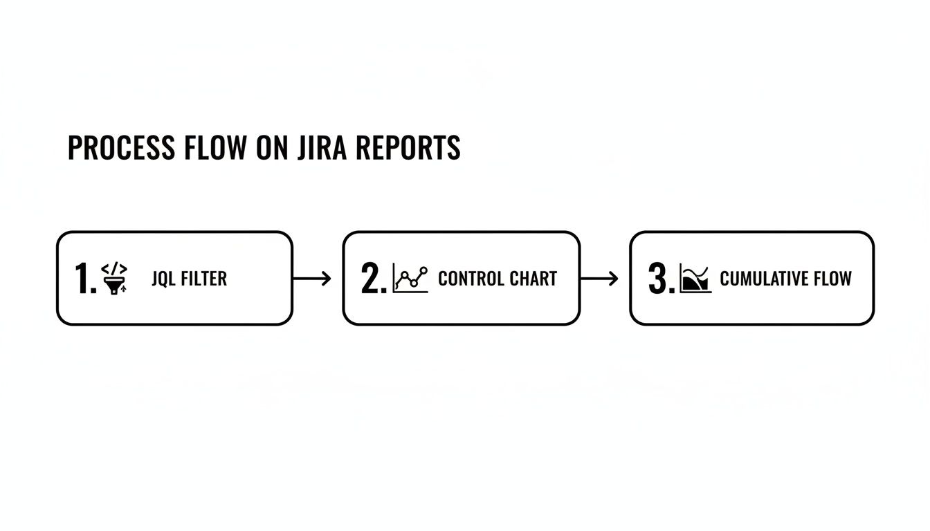
Filtering Reports to Get Actionable Insights
Generic reports are interesting, but they often don't tell you what to do. The real magic happens when you use Jira Query Language (JQL) to filter these reports and zero in on specific parts of your process.
Instead of looking at every issue, create filters for your board to analyze just one team's performance, a single feature, or a certain type of work.
Here are a few JQL examples to get you started:
- By Epic:
parentEpic = "PROJ-123"- Use this to: See if a major feature is getting bogged down in a specific stage.
- By Team:
labels = "team-alpha"- Use this to: Compare different squads' workflows to see what's working well.
- By Issue Type:
issuetype = Bug- Use this to: Isolate your bug-fixing process and measure how quickly issues are resolved.
When you combine sharp JQL filters with the Control Chart and CFD, you go from just looking at data to actually diagnosing problems. These native tools provide a solid starting point for anyone serious about improving their workflow.
To get a broader look at all of Jira's reporting options, you can get a great overview when you learn how to create a report in Jira. This is especially helpful when you need to understand how to effectively track QA metrics using Jira for more specialized reporting needs.
Building Custom Trackers with JQL and Automation
While Jira's built-in reports offer a decent bird's-eye view, they often don't have the granularity you need for real process improvement. When the standard charts can't answer your specific questions about time in status in Jira, it’s time to build a custom solution with Jira Automation and JQL.
This method shifts you from just observing data to actively collecting it. Instead of being limited to Jira's default cycle time calculations, you can create a permanent, searchable audit trail of every single status transition for every ticket.
The Power of Automated Timestamps
The strategy is simple and powerful: set up an automation rule that stamps the date and time every time an issue moves into a specific status. By creating custom date/time fields like "Review Start Time" or "QA Entry Time," you build a precise, queryable record of your workflow.
Suddenly, you're no longer constrained by the pre-set calculations in Jira's reports. You have raw, accurate data that you can slice and dice however you see fit on your dashboards.
Actionable Insight: Automating timestamps with custom fields puts you in the driver's seat. You can measure the exact time spent in any phase of your workflow, calculate specific SLAs, and build dashboards that spotlight the bottlenecks that truly matter to your team.
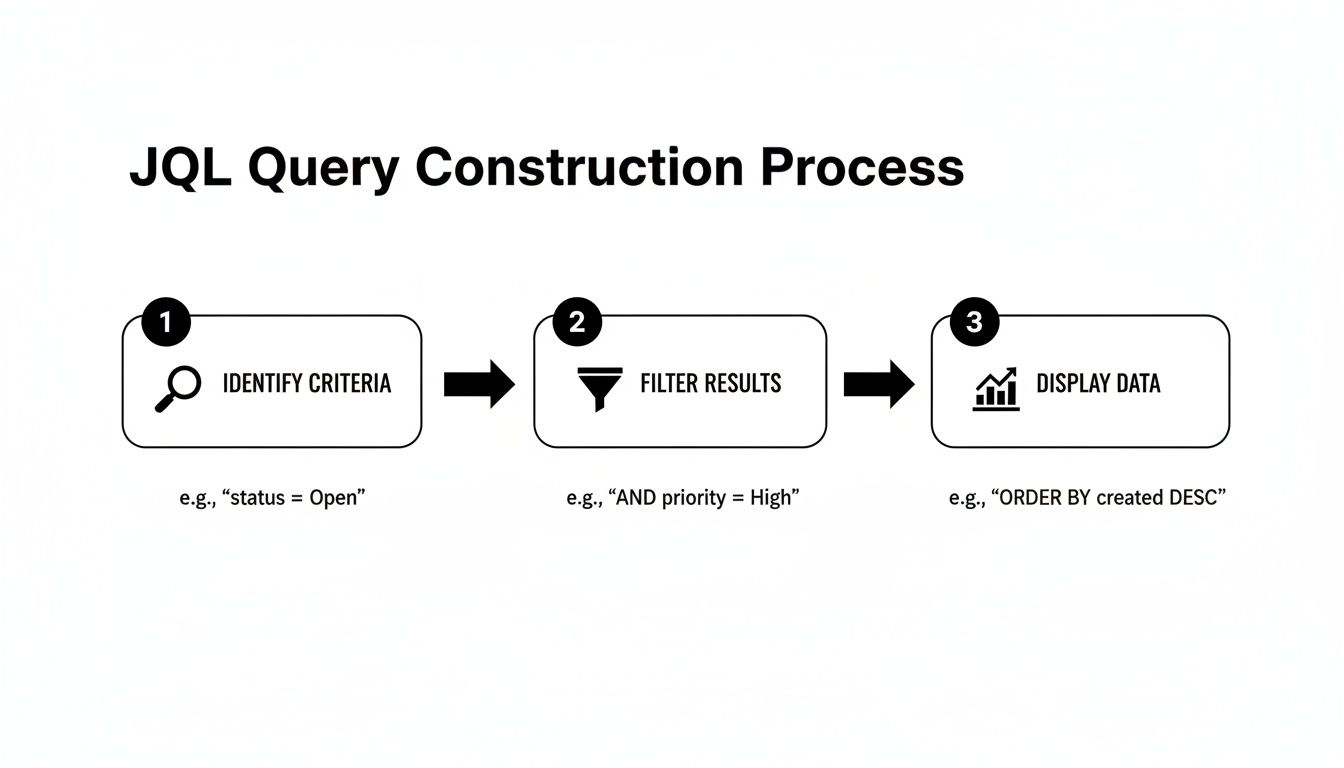
This approach lets you turn a precise JQL filter into a powerful visualization, giving you a clear picture of your team's flow.
As the diagram shows, a well-crafted JQL query is the foundation. It feeds directly into tools like the Control Chart or Cumulative Flow Diagram, turning raw data into real-world insights.
Creating Your Status Timestamp Automation
Let’s walk through a common real-world scenario. Imagine you want to track exactly how long issues linger in the "In Review" status to make sure pull requests aren't going stale.
First, create two custom fields in your Jira instance:
- A
Date Timefield calledReview Entry Date. - A
Numberfield calledTime in Review (Days).
Once those fields are ready, build a two-part automation rule.
Part 1: When an issue enters "In Review"
- Trigger: When an issue is transitioned to "In Review".
- Action: Edit the issue and set the
Review Entry Datefield to the current time using the smart value{{now}}.
Part 2: When an issue leaves "In Review"
- Trigger: When an issue is transitioned from "In Review".
- Action: Edit the issue again. This time, set the
Time in Review (Days)field using this smart value:{{now.diff(issue.customfield_XXXXX).days}}. You'll need to replaceXXXXXwith the actual ID of yourReview Entry Datecustom field.
This simple setup creates an incredibly valuable feedback loop. The moment a developer resolves a code review, Jira instantly calculates and stores the total time that ticket spent waiting for approval.
Unleashing Your Data with JQL
With your automation collecting data, JQL becomes your primary tool for analysis. That custom number field is now a powerful filter you can use to ask very specific questions.
For example, want to find all tickets that were stuck in review for more than three days last quarter? This JQL query will pull that list instantly:
project = "Your Project" AND "Time in Review (Days)" > 3 AND resolved >= -90d
This is the kind of insight that’s impossible to get from standard reports but becomes trivial with a bit of automation. You can save this query as a filter and plug it into a dashboard gadget to create a live "SLA Breach" widget for your team to monitor. To get the most out of this, you’ll want to know how to properly create a filter in Jira to power these custom views.
This DIY approach also reflects a much bigger trend. With 93% of organizations reporting that automation has boosted their efficiency, using Jira Automation for this kind of tracking is a perfect, practical example. It cuts out the manual grunt work and gives you the exact data you need to fix those critical handoffs between teams.
When It’s Time to Bring in a Marketplace App for Deeper Insights
Native Jira reports and custom automation are great places to start, but eventually, you might hit a wall. When you need more sophisticated reporting, proactive process controls, and solutions that work right out of the box, the Atlassian Marketplace is the place to go. These apps are purpose-built to solve the complex challenges of tracking time in status in Jira at scale.
This is about more than just building prettier charts. It's about shifting your entire mindset from passively measuring delays to actively preventing them from happening in the first place. Marketplace apps give you a level of control and automation that's incredibly difficult to build yourself, especially as your team grows.
Moving From Measurement to Proactive Intervention
Sure, a custom automation rule can tell you a ticket was in 'Blocked' status for 48 hours after the fact. A dedicated Marketplace app, however, can step in and take immediate action while it's happening. That’s the real game-changer: moving from historical analysis to real-time process governance.
Here are some actions you can implement with an app that are tough to do with native tools alone:
- Automated SLA Alerts: An app can instantly notify a manager and escalate a ticket if it lingers in the 'Blocked' status for more than a set time, say, 24 hours.
- Enforcing Quality Gates: Some apps can act as a gatekeeper, preventing an issue from leaving 'In Review' until a specific checklist is completed and all its sub-tasks are closed out.
- Complex Handoffs: An app like Nesty from Harmonize Pro can orchestrate tricky, multi-step handoffs. When a developer moves a ticket to 'Ready for QA', the app can automatically reassign it to the QA lead, ping a specific Slack channel, and even attach the latest build artifacts.
This kind of proactive control hardens your process. It dramatically reduces the chance of human error and ensures everyone follows the workflow standards you’ve agreed upon, every single time. Your team is freed from the manual coordination that so often grinds things to a halt.
When an App Delivers Clear ROI
Investing in a paid tool needs a solid justification. The decision usually boils down to whether the app saves you more time, money, and headaches than it costs. For larger organizations, this isn't just a nice-to-have; it's a critical part of maintaining efficiency.
With Jira Cloud now supporting up to 100,000 users per site, scalable and automated process controls are essential for good governance. As Jira's scalability for large enterprises has grown, Marketplace apps that manage time in status have become crucial for maintaining workflow integrity in these massive, complex instances.
The Atlassian Marketplace is filled with powerful options for reporting and process control.
This vast ecosystem of apps is designed to extend Jira’s core features, helping you tackle specific needs like advanced time tracking and deep workflow automation.
Actionable Insight: The real value of a Marketplace app is its ability to turn your ideal process—the one you wrote down on a wiki page—into a self-managing, automated workflow that’s actually enforced inside Jira.
So, how do you choose? Deciding between native tools, building your own automation, or buying an app involves a trade-off. Here’s a quick look at how they stack up.
Comparing Methods for Tracking Time in Status
This table breaks down the pros and cons of each approach, helping you decide which path is right for your team's needs and resources.
| Method | Setup Effort | Reporting Flexibility | Best For |
|---|---|---|---|
| Native Jira Reports | Low | Low to Medium | Quick health checks and identifying obvious, high-level bottlenecks. |
| Custom Automation | Medium | High | Teams that need specific, granular data points not available in default reports. |
| Marketplace Apps | Low to Medium | Very High | Teams needing advanced reporting, proactive alerts, and enforced process controls out-of-the-box. |
Ultimately, the choice comes down to your pain points. If you find your team is constantly spending time manually pulling data, policing workflows, or chasing people down for updates, a Marketplace app is almost certainly a worthwhile investment. It lets your team get back to doing their actual work instead of just managing the tool.
Practical Tips and Common Pitfalls to Avoid
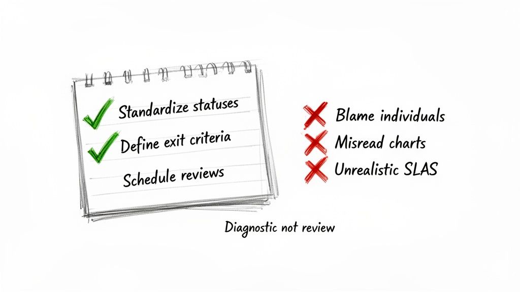
Getting your hands on time in status Jira data is a great start, but the real magic happens in how you use it. Just looking at the numbers won't change a thing. You need a game plan to turn those metrics into genuine process improvements and build a culture of continuous improvement, not one of blame.
Think of these metrics as a health check for your workflow, not a report card for your team members. When you see a long delay, the first question should always be, "What in our system caused this?" not, "Who took so long?"
Standardize and Define Your Workflow
Inconsistent workflows are the kryptonite of accurate data. If one team uses "Peer Review" while another uses "Code Review," you can't compare their performance. Getting everyone on the same page is the bedrock of reliable measurement.
Before you track anything, get your team to agree on a single, shared workflow. Once you’ve done that, define crystal-clear exit criteria for every single status.
What does it really mean for a task to move from 'In Progress' to 'In Review'?
- All code is committed to the main branch.
- Unit tests have been written and are passing.
- The ticket is linked to the pull request.
Having an explicit checklist like this kills ambiguity. It makes handoffs clean and complete, preventing the dreaded back-and-forth ticket bouncing that inflates your time-in-status metrics.
Avoid Using Data as a Weapon
This is the fastest way to make your metrics worthless. The moment you use time in status to call out a team member or factor it into a performance review, you've poisoned the well. People will immediately start finding ways to game the system to make their numbers look better, and your data will become a work of fiction.
Actionable Insight: Treat a high time in status as a signal that the process is failing the person, not the other way around. Is a developer waiting on an environment? Is QA blocked by vague requirements? Those are system problems, not people problems.
Instead of pointing fingers, use the data as a conversation starter. A consistently high time in the 'Blocked' status is your cue to get the team together and figure out how to improve dependency management or communication with other departments.
Common Misinterpretations and How to Correct Them
It’s tempting to glance at a chart and jump to a conclusion, but the data only shows you the what. It's up to you and your team to dig in and find the why.
Here are a few common traps to avoid:
- Misreading Control Charts: Don't freak out over one data point that's way off the average. A single complex task taking longer is normal. Instead, look for clusters of outliers or a steadily rising trend line—those signal a systemic issue.
- Setting Unrealistic SLAs: Never pull a Service Level Agreement (SLA) out of thin air, like "all reviews must be done in 24 hours." First, you need a baseline. Measure your average time in review for a few sprints, understand your current reality, and then set a realistic improvement goal.
- Ignoring 'On Hold' Statuses: If your reports don't pause the clock for statuses like 'On Hold' or 'Waiting for Customer,' your metrics will be skewed. Make sure your reporting tool can tell the difference between active work time and legitimate waiting periods.
Ultimately, this is all about creating a healthy feedback loop. By setting clear rules for your workflow and using data to improve the system, not punish people, you can unlock significant gains. Exploring advanced Jira workflow automation can be a great way to enforce these standards and take the manual effort out of the equation.
Answering Your Time in Status Questions
Once you start digging into Time in Status, you’ll inevitably run into some specific, real-world questions. It's one thing to know the theory, but another to apply it to a messy, living workflow. Let's tackle some of the most common hurdles I see teams face.
This isn't just about definitions; it's about making sure your data is clean, accurate, and actually helps you improve.
How Should We Handle 'On Hold' or 'Blocked' Statuses?
This is a big one. If you don't properly account for statuses where work is legitimately paused, your metrics for active statuses like 'In Progress' will get skewed, making it look like work takes much longer than it actually does.
The best way to handle this is to configure your reporting tool—whether it's Jira's native Control Chart or a Marketplace app—to exclude specific statuses from its cycle time calculation. For example, you can tell the tool to start the clock when an issue moves to 'In Progress' and stop it when it hits 'Done', but completely ignore any time it spent sitting in 'On Hold'. This gives you a much truer picture of active work time.
What's the Real Difference Between Cycle Time and Time in Status?
It's easy to mix these two up, but they tell you very different stories about your workflow.
Think of it this way:
- Time in Status is a close-up view. It measures how long an issue sat in one single column, like ‘Code Review’ or ‘QA Testing.’ It’s perfect for pinpointing a bottleneck in one specific step.
- Cycle Time is the wide-angle shot. It measures the total time an issue takes to travel from a starting point (like ‘In Progress’) to a finish line (like ‘Done’). It’s the full journey.
The Bottom Line: You use Time in Status to figure out why your Cycle Time is what it is. If your overall Cycle Time is creeping up, a quick look at the Time in Status for each column will show you exactly which stage is the culprit.
Which Report Should I Show to My Team vs. My Boss?
Not everyone needs to see the same raw data. You'll get much better results by tailoring the report to who you're talking to. Here’s a simple breakdown I use:
- For Developers and QA: The Control Chart is gold. It gives them direct, granular feedback on the cycle time of individual stories and bugs. It's the perfect tool for retrospectives when the team wants to discuss why a specific ticket took way longer than everything else.
- For Scrum Masters and Project Managers: The Cumulative Flow Diagram (CFD) is your best friend. It gives you that bird's-eye view of workflow health and instantly shows where work is piling up. If you need to manage flow and spot systemic bottlenecks, this is your go-to report.
- For Executives and Stakeholders: Keep it simple. A custom Dashboard Gadget showing high-level metrics is far more effective. For example, a pie chart showing the percentage of tickets that met the "Time in Review" SLA is much more useful to a VP than a complex scatter plot they have to decipher.
Matching the report to the audience makes sure the data leads to action, not confusion.
Ready to stop just tracking delays and start preventing them? Harmonize Pro's flagship app, Nesty, transforms your Jira tickets into self-managing workflows. Enforce quality gates, automate complex Dev→QA handoffs, and ensure every step is completed on time, every time—all within a single Jira issue. Discover how Nesty can bring order and predictability to your most complex processes by visiting the Harmonize Pro website.