Tag: jira reporting

  • Jira and Power BI A Guide to Actionable Dashboards

    Jira and Power BI A Guide to Actionable Dashboards

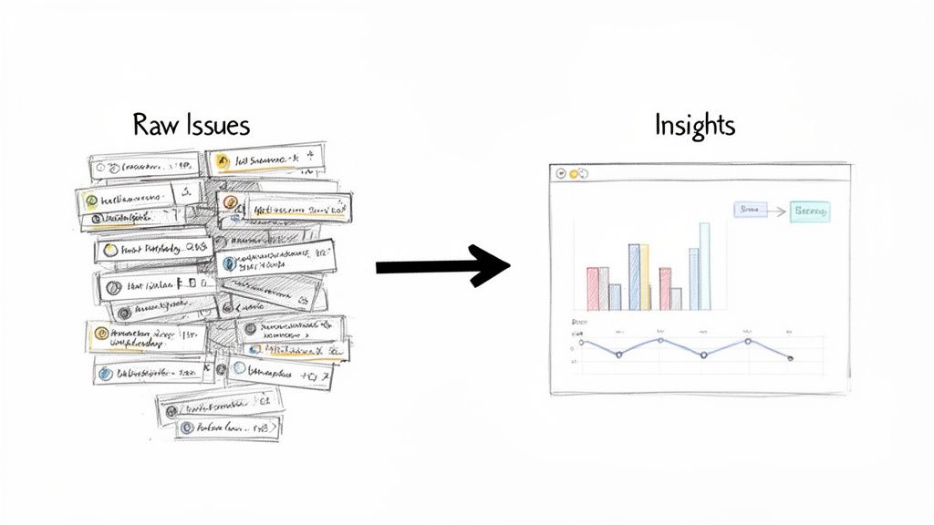
    Connecting Jira to Power BI is more than just ditching manual CSV exports. It's about turning your raw project data into a powerhouse for strategic decision-making. You're moving from simple, static charts to real-time, interactive business intelligence. The goal is to build dashboards that let you visualize everything from sprint health and cycle times to bug resolution rates, all in one place.

    Why Jira and Power BI Is A Powerful Combination

    Linking these two platforms creates a single source of truth that changes how your organization uses project data. Engineering leads, QA managers, and product owners can finally have data-driven conversations with stakeholders who don't spend their days inside Jira. The immediate, actionable goal is to spot project risks long before they spiral into major problems.

    This pairing helps you get ahead of the curve, shifting from reactive fire-fighting to proactive strategy. Instead of digging through a dozen tickets to explain a missed deadline, you can pull up a dashboard that clearly shows a bottleneck in the QA handoff process.

    Unlock Strategic Business Insights

    The magic happens when you stop exporting spreadsheets and start building dynamic reports. This move allows for much deeper analysis and helps everyone make smarter decisions, faster. To get a feel for what’s possible, it helps to know how Power BI fits into the larger Microsoft Power Platform.

    For large organizations trying to scale their project analytics, this integration is a game-changer. Teams that use a dedicated Jira-to-Power BI connector can build unlimited custom datasets using JQL, allowing for truly tailored dashboards for sprint metrics and bug trends. You can check out some of these Jira and Power BI connector capabilities to see what's possible.

    The bottom line is this: you’re transforming Jira from a simple task tracker into a robust business intelligence engine. It gives you the visibility needed to fine-tune workflows, boost team performance, and deliver projects with far more predictability.

    From Manual Reporting to Automated Dashboards

    Think about what you could do with the hours you'd save by not having to manually compile data every week. That's what this automation does—it handles the grunt work, freeing you up for more important strategic thinking.

    • Visualize Sprint Health: Get an immediate answer to "Are we on track?" by monitoring burndown charts, scope creep, and story point completion in real-time.
    • Analyze Cycle and Lead Times: Pinpoint exactly where work gets bogged down in your development process, from the moment a task is started to when it's finally marked "Done."
    • Monitor Bug Resolution Rates: Get a clear picture of how quickly your team crushes critical bugs and measure the overall quality of your releases.

    Automating these reports means everyone is always looking at the freshest data. Of course, the quality of your reports depends on the quality of your data. Following the best practices in Jira from the very beginning ensures your Power BI dashboards are both accurate and reliable.

    Choosing Your Jira to Power BI Connection Method

    So, you want to get your Jira data into Power BI. Good call. But how you build that bridge is the first big decision you'll make, and it's a trade-off between control, convenience, and how much you want to tinker under the hood. The right path really depends on your team’s technical chops, what you need to report on, and frankly, how much time you have to spare.

    Let's start with the most hands-on approach: using Jira’s native REST API with Power BI's Web connector. This route gives you ultimate control. If you love writing very specific JQL queries to pull exactly the data you need and nothing more, this is for you. But with great power comes great responsibility. You're on the hook for managing API token authentication and—this is a big one—staying within Jira's rate limits to avoid getting throttled. The Atlassian community forum has some great discussions if you decide to go down this rabbit hole.

    At the complete opposite end of the spectrum is the humble CSV export. Need a quick data snapshot for a single presentation tomorrow? This is your answer. It's fast, simple, and gets the job done for one-off tasks. But let's be clear: it's a manual process, it doesn't scale, and it’s completely impractical for any kind of ongoing, automated reporting.

    Finding the Right Balance for Your Team

    For most engineering and QA teams I've worked with, the sweet spot is a third-party marketplace connector. These tools are purpose-built to do one thing well: connect Jira to Power BI. They handle all the messy stuff—authentication, API pagination, rate limiting—so you don't have to. You get to skip the infrastructure headaches and jump straight into building reports.

    This approach is a lifesaver, especially if you don't have a data engineer on standby. It just works, ensuring your data refreshes are consistent and reliable.

    To help you figure out where you land, this decision guide lays out the options based on your end goal.

    Flowchart for Jira and Power BI: a decision guide for data-driven insights based on reporting needs.

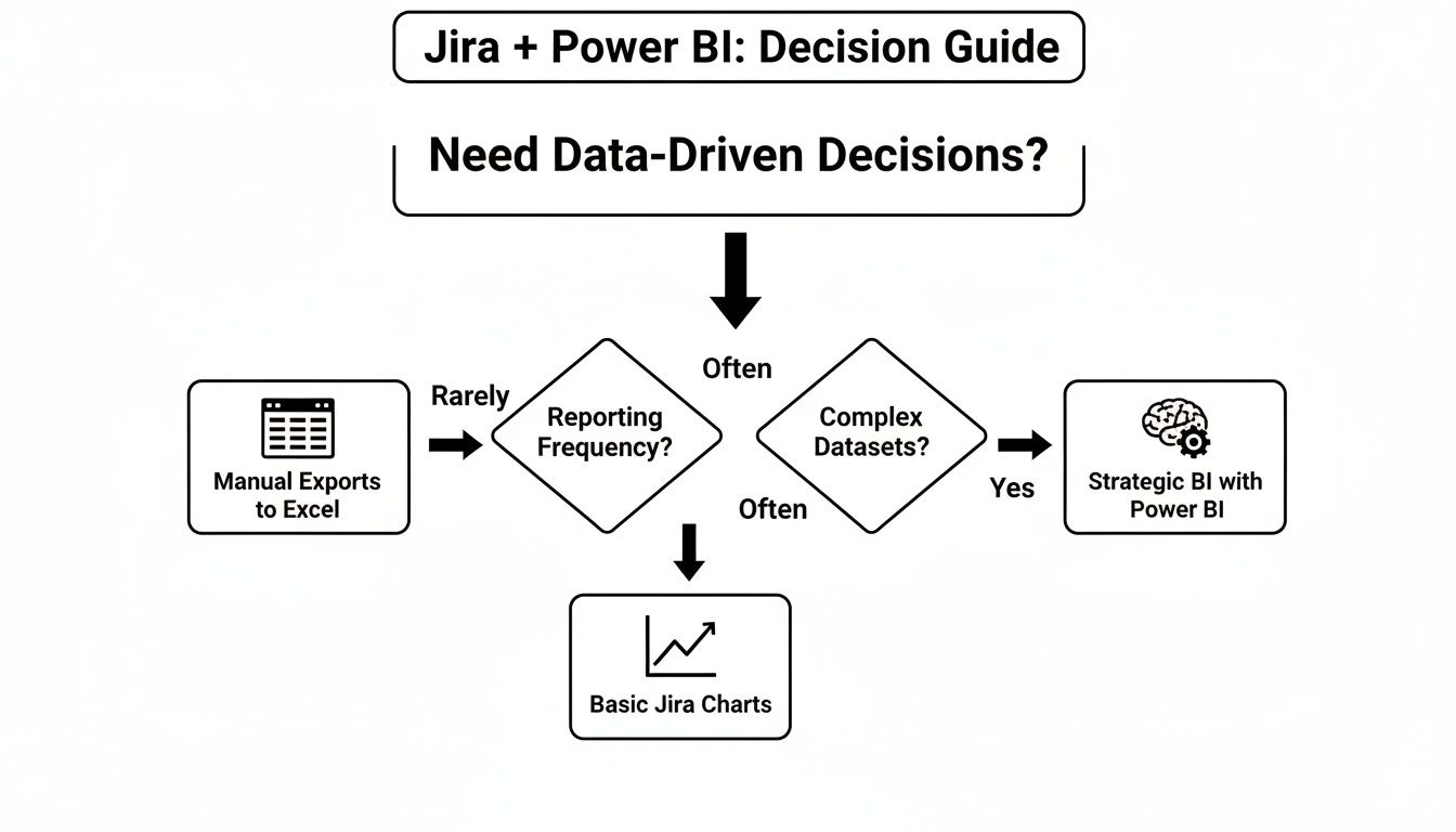
    As you can see, if you're aiming for strategic, ongoing business intelligence, you'll want a dedicated connection. For those quick-and-dirty analyses, a manual export might be all you need.

    Jira to Power BI Connection Method Comparison

    To make the choice even clearer, let's put these methods side-by-side. Seeing the pros and cons laid out can quickly highlight the best fit for your situation.

    Method Technical Effort Best For Key Limitation
    Marketplace Connector Low Automated, scalable, and reliable dashboards with minimal setup. Requires a subscription for a third-party application.
    REST API + Web Connector High Full control over data queries and complex, custom integrations. Requires ongoing management of API tokens and rate limits.
    CSV Export Very Low Quick, one-time data analysis for presentations or simple charts. Completely manual, not scalable, and prone to human error.

    Ultimately, picking the right connection method is about setting a solid foundation. Once you have a reliable data pipeline in place, you’re ready for the fun part. The next step is to learn how to create a report in Jira that actually tells a story with your metrics.

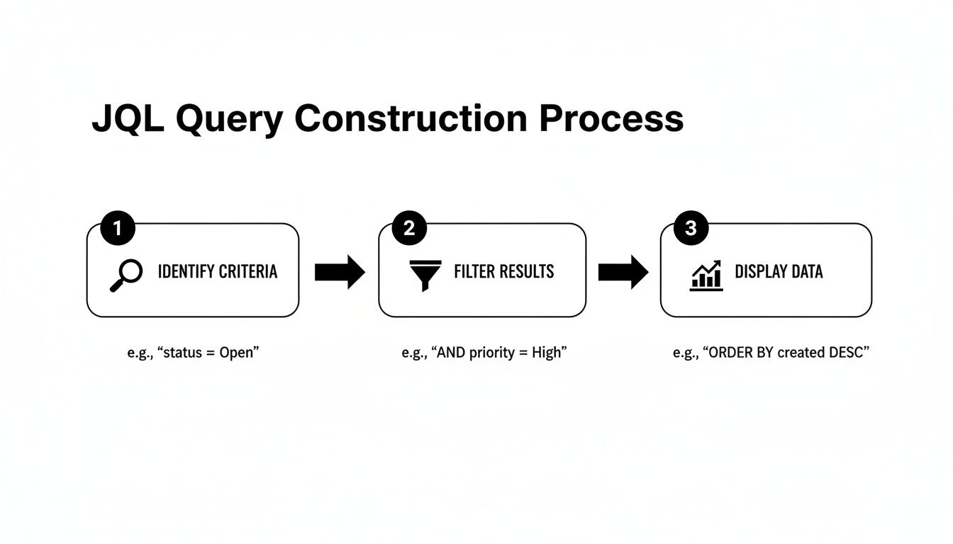
    Crafting Your Dataset with JQL and Custom Fields

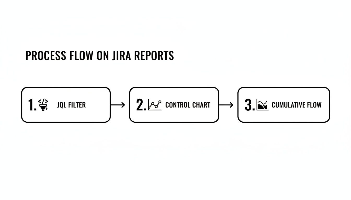
    The quality of your Power BI dashboards lives and dies by the data you pull from Jira. It's a classic case of "garbage in, garbage out." This is where getting good with Jira Query Language (JQL) becomes your most valuable skill, letting you move past generic data dumps and start building clean, focused datasets.

    Think of JQL as a precision filter. Instead of trying to import every single issue from your entire Jira instance—which is a recipe for slow reports and headaches—you can write queries that pull only the data you actually need. This not only makes your reports faster but also keeps your data model much simpler to manage down the line.

    Diagram illustrating a filtered dataset funnel processing JQL queries for custom fields and story points.

    Building Smart JQL Queries

    A sharp, well-written JQL query is the bedrock of any useful dashboard. It's your first line of defense, making sure only relevant information ever makes it into your analysis.

    For instance, a QA manager probably doesn't need to see every story and task. They might only care about bugs from a specific project that were wrapped up in the last sprint. A good JQL query makes that possible.

    Here are a few practical examples you can adapt right now:

    • Bugs Resolved Last Sprint: project = "Phoenix" AND issuetype = "Bug" AND status = "Done" AND resolutiondate >= startOfWeek(-1) AND resolutiondate <= endOfWeek()
    • Stories for an Upcoming Release: project = "MobileApp" AND issuetype = "Story" AND fixVersion = "Q3 Release"
    • High-Priority Tech Debt: project = "BackendServices" AND labels = "tech-debt" AND priority = "High"

    Queries like these give you a targeted, manageable dataset that’s so much easier to work with in Power BI. For a deeper look at the logic, the same principles for building filters apply, and this guide on how to create a filter in Jira is a great resource.

    Taming Jira Custom Fields

    Let's be honest, the real insights are often buried in your custom fields. I’m talking about things like Story Points, Epic Link, or maybe team-specific statuses you’ve configured. Unfortunately, these fields are notorious for causing trouble when you pull them into Power BI. They often show up as nested records or lists, not the clean, simple columns you want.

    The secret is to go in expecting this. When you connect to Jira, you should know that you will almost certainly need to spend time in Power Query to "un-nest" or expand those custom field columns to get to the good stuff.

    A perfect example is the "Story Points" field. It might import as a record that you have to click into. You’ll need to use Power Query's "Expand Column" feature to pull out the actual number. Another common one is a "Components" field, which might be a list. To analyze work by component, you'll have to expand that list into new rows.

    Dealing with these fields isn’t something you do at the end; it’s a core part of building a solid data model from the start. By planning ahead to extract data from these critical fields, you’re ensuring your reports can answer the questions that really matter, like measuring team velocity or tracking progress against epics. This prep work is what turns a messy data dump into a powerful asset.

    Shaping Your Data for Performance and Insight

    Pulling your Jira data into Power BI is a solid first step, but let's be honest—the raw data is a mess. It's not even close to being report-ready. Think of it as a pile of groceries on your kitchen counter; you can't just serve it up. You have to prep, chop, and combine everything to make something useful. This is exactly where Power Query, Power BI’s data transformation engine, becomes your best friend.

    Your first job is to take all that messy, nested data from Jira and flatten it into clean, usable columns. This initial shaping phase is absolutely non-negotiable if you want a data model that performs well and actually makes sense. It’s the foundation for everything else you'll build.

    Essential Data Shaping in Power Query

    When you first load Jira data, especially from a REST API or a connector, you'll see a lot of columns that just say [Record] or [List]. This is a classic sign of nested data, and it's especially common with custom fields, assignees, components, and other complex fields. The goal here is to expand those records and lists into valuable information.

    Start by zeroing in on the most critical columns containing this nested data. The fields column is almost always the main culprit, often hiding dozens of other fields inside of it.

    • Expand Nested Records: Find the column header with the double-arrow icon, right-click it, and choose "Expand." Be selective here. Only pick the fields you actually need for your reports, like summary, issuetype, status, and created. Deselecting everything else is one of the most effective performance optimizations you can make.
    • Split Columns: Sometimes data gets jammed together, like a user's name and their ID. The "Split Column" feature is perfect for breaking these into separate, more useful columns.
    • Change Data Types: Power BI does its best to guess data types, but you have to double-check its work. Make sure dates are set to Date/Time, story points are Whole Number, and any time-tracking fields are Decimal Number. Getting these wrong is a surefire way to run into frustrating DAX errors down the road.

    Here's a piece of hard-won advice: remove any columns you don't need for your final report as early as possible in your Power Query steps. Every single extra column bloats your data model, which can kill your refresh times and make your report feel sluggish.

    Modeling for Key Jira Metrics

    Once your data is clean and tidy, it's time to build the data model. This is where you create relationships between your different queries and start writing DAX (Data Analysis Expressions) measures to calculate the metrics that truly matter to your team.

    For instance, you'll likely have one query for your Jira issues and another for your sprint details. By creating a relationship between them (probably on a sprint.id field), you can analyze issue data within the context of specific sprints.

    The data model is where you embed your core business logic. Instead of doing one-off calculations inside individual charts, you create centralized DAX measures. This keeps everything consistent and reliable across your entire report.

    Here are a few essential DAX formulas to get you started:

    • Cycle Time: Cycle Time = DATEDIFF(Issues[InProgressDate], Issues[DoneDate], DAY)
    • Lead Time: Lead Time = DATEDIFF(Issues[CreatedDate], Issues[DoneDate], DAY)
    • Total Story Points: Total Story Points = SUM(Issues[StoryPoints])

    Creating these as measures, rather than calculated columns, is almost always better for performance. They get calculated on the fly when someone interacts with a visual, keeping the report feeling fast and responsive.

    The Impact of Structured Jira Workflows

    The cleaner your Jira process is, the easier your Power BI reporting will be. Inconsistent workflows where teams use different statuses or skip critical steps just create a data nightmare. You end up having to build complex, fragile workarounds in Power Query to clean it all up.

    This is where tools like Nesty for Jira can be a game-changer. By enforcing structured workflows with features like nested checklists and automated transitions, you guarantee every issue follows a predictable path. You can, for example, build a workflow that automatically captures the precise timestamp when a ticket moves from "In Progress" to "In Review."

    That kind of process discipline means the data flowing into Power BI is already clean, consistent, and trustworthy. You'll spend far less time wrestling with data transformations and way more time uncovering actual insights.

    Building Dashboards Your Team Will Actually Use

    Alright, you've connected Jira, pulled in your data, and shaped it into something useful. Now comes the fun part: building dashboards that your engineering and QA teams will actually want to use. The goal here isn't just to make pretty charts; it's to answer real-world questions and drive meaningful improvements.

    A great dashboard tells a story at a glance. A team lead should be able to look at it and immediately spot a bottleneck, understand how a sprint is tracking, or get a handle on quality, all without having to manually sift through Jira tickets. This is where the magic of combining deep Jira data with Power BI's visualization capabilities really happens.

    A digital dashboard displays three charts: Sprint Health, Cycle Time, and QA Handoff, showing project metrics.

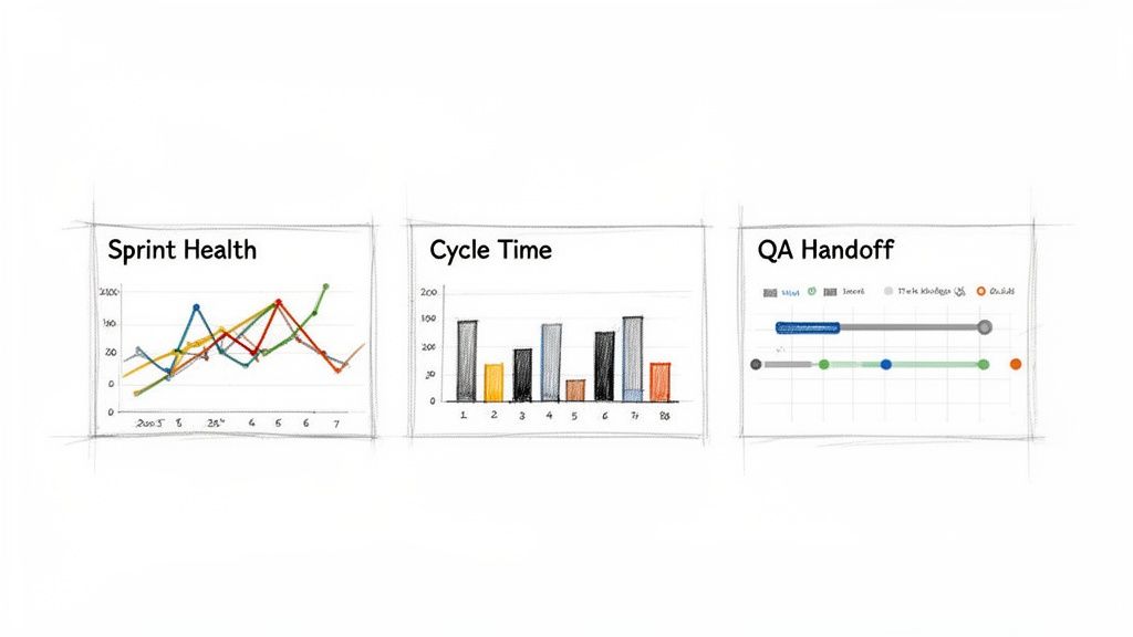
    Look at the dashboard above. It's a perfect example of how combining metrics like burndown, cycle time, and handoffs gives a complete picture of project health. It's all about picking the right visuals to tell the right story for the people who need to hear it.

    The Sprint Health Dashboard

    Every engineering manager lives and breathes by one question: "Is this sprint on track?" A Sprint Health dashboard gives them that answer instantly.

    Don't just stop at a basic burndown chart, though. Make it interactive. Overlay a line chart showing the ideal burndown against the actual remaining work. Right next to it, add a stacked bar chart that shows completed story points versus scope creep—any story points that were added after the sprint started. This immediately tells you, "Are we behind schedule because we're slow, or because we keep adding more work?"

    • Actionable Question: "Are we going to hit our sprint goal, and what's standing in our way?"
    • Key Visuals: A line chart for the burndown, a stacked bar for scope changes, and a few KPI cards for the completion percentage.
    • Metrics to Display: Remaining Work (in Story Points or Hours), Completed Work, Added Work (Scope Creep), and Team Velocity.

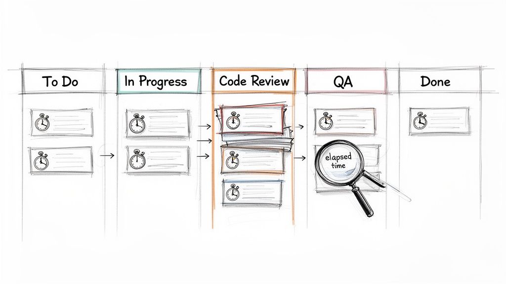
    Cycle Time Analysis for Bottleneck Detection

    Cycle time is, without a doubt, one of the most insightful metrics you can track. It measures the total time from when work starts ("In Progress") to when it’s truly finished ("Done"). A solid Cycle Time dashboard is your best tool for finding out exactly where work is getting stuck.

    My favorite visual for this is a scatter plot. I plot each completed ticket with its creation date on the X-axis and its cycle time in days on the Y-axis. You can instantly spot the outliers—those tickets that took forever—and see if your cycle time is trending up or down.

    Another great option is a simple bar chart showing the average cycle time broken down by issue type or even by assignee. You might discover that bugs take way longer to fix than stories, or that one particular developer is consistently getting overloaded. As you get your hands dirty building these, this practical guide on how to create a Power BI dashboard is a fantastic resource, walking you through everything from connecting data to creating compelling visuals.

    QA Handoff and Quality Metrics

    The handoff between developers and the QA team is a classic source of friction. A QA Handoff report shines a light on this critical step, measuring how long tickets languish in a "Ready for QA" status before someone actually starts testing them.

    For this, I often use a straightforward table or matrix visual. List all the tickets currently waiting for QA and sort them by the longest wait time. You could even add a gauge visual to track the average handoff time against a target, like a 48-hour service-level agreement (SLA). It’s a simple but effective way to encourage everyone to keep work flowing smoothly through the system.

    Common Questions About Jira and Power BI

    Even with a solid plan, connecting Jira and Power BI can throw some curveballs. Let's walk through a few of the most common snags I've seen teams run into and how to get past them.

    These issues pop up all the time, but the fixes are usually pretty straightforward once you know where to look. Nailing these details is the key to building a reporting setup you can actually rely on.

    How Do I Handle Jira API Rate Limits in Power BI?

    Ah, the dreaded Jira API rate limit. It's there to protect Atlassian's servers, but it can easily torpedo your scheduled data refreshes, especially with large datasets. The classic sign? A timeout error right in the middle of a refresh.

    The easiest first step is to schedule your Power BI refreshes during off-peak hours, like overnight. But if you're pulling a lot of data directly from the API, your best bet is to set up incremental refresh in Power BI. This is a game-changer. It tells Power BI to only grab issues that have been created or updated since the last run, slashing the number of API calls you make.

    For companies with huge or super-active Jira instances, a dedicated third-party connector is often the sanest path forward. These tools are built from the ground up to manage API calls efficiently, automatically handle rate limits, and use smart backoff logic. It takes all the guesswork out of keeping your data pipeline stable.

    Why Are My Custom Fields Not Showing Up Correctly?

    I get this question more than any other. You've got critical data in a custom field, but when you pull it into Power BI, all you see is [Record] or [List]. Don't panic—this is completely normal.

    Your data isn't gone; it's just nested inside that column. You just need to unpack it in the Power Query Editor.

    • If you see [Record]: Click the expand icon (it looks like two arrows pointing away from each other) in the column header. This will reveal the underlying properties, letting you pick the specific values you need, like .name or .value.
    • If you see [List]: This usually means you're dealing with a multi-select field. The "Expand to New Rows" option is your friend here. It will create a separate row for each selected value, which makes it possible to properly filter and analyze them.

    What Is the Best Way to Calculate Cycle Time in Power BI?

    Calculating accurate cycle and lead times is all about having access to the issue history. You absolutely need the timestamps for when an issue moved into and out of each status in your workflow.

    The most reliable way to get this is by using a connector that's specifically designed to pull Jira's full issue history. This gives you a clean, pre-packaged table of all status transitions, ready to go. If you're hitting the API directly, you'll have to add changelog to the expand parameter in your query to get this data.

    Once you have the history, you can build your calculations in Power BI using DAX. The DATEDIFF() function is your workhorse here. You’d create a measure that finds the timestamp for an issue entering "In Progress" and another for it entering "Done," then calculate the difference in days.


    For teams that want to guarantee this data is clean from the very beginning, a tool like Harmonize Pro can be a huge help. Their app, Nesty for Jira, helps enforce structured workflows right inside Jira, making sure every status change is captured consistently. When your source data is that clean and reliable, building powerful Power BI dashboards for metrics like cycle time becomes much, much easier.

  • A Practical Guide to Time in Status Jira for Workflow Mastery

    A Practical Guide to Time in Status Jira for Workflow Mastery

    So, what exactly is Time in Status in Jira?

    Put simply, it's the exact amount of time an issue hangs out in a specific stage of your workflow. Think 'In Progress,' 'Code Review,' or 'Waiting for QA.' It's a stopwatch for each step in your process, telling you precisely how long things actually take. This isn't guesswork; it's concrete data that shows you where work flies and where it gets stuck.

    Why Tracking Time in Status Is a Game-Changer

    A hand-drawn Kanban board illustrating a software development workflow, showing tasks, bottlenecks, and elapsed time.

    We've all been there—sprints feel crunched, and deadlines keep slipping, but it’s hard to put a finger on exactly why. Hidden delays are often the culprit. A task might look like it’s moving along, but the real story is how much time it spends just sitting idle between active work.

    Tracking time in status is the diagnostic tool you need to expose these hidden truths. It transforms that vague feeling of inefficiency into a clear, actionable insight. Is 'Code Review' the black hole where all tickets disappear? Do issues languish for days in 'Waiting for QA'? This one metric holds the answers.

    This kind of visibility is powerful. It equips everyone, from Scrum Masters to Product Managers, to make smarter, system-level decisions. It’s not about watching people—it's about watching the process.

    Uncovering Workflow Bottlenecks

    The number one reason to track this metric is its uncanny ability to shine a spotlight on friction. When you discover that tickets consistently spend 70% of their lifecycle in a single status, you've just found your biggest opportunity for improvement.

    A long time in status can point to a few common culprits:

    • Resource Constraints: Maybe the QA team is overloaded, or only one senior engineer is available to approve pull requests.
    • Clunky Handoffs: It could be that developers aren't providing the right info when they pass a ticket to testing, causing it to stall out.
    • External Dependencies: You might find a task is stuck 'Waiting for Feedback' from a stakeholder who isn't part of the core team.

    In fact, Atlassian’s own research found that teams can lose a staggering 25% of their time just looking for information. Time in status helps you see exactly where those information gaps and process snags are happening, so you can start reclaiming that lost productivity.

    Actionable Insight: Time in status isn't a performance metric for individuals; it's a health check for your process. Use it to find and fix systemic problems, not to point fingers.

    Making Data-Driven Decisions

    With hard numbers on status timing, your conversations change dramatically. Instead of saying, "I feel like code reviews are taking forever," you can state, "The average time in 'Code Review' was 4.2 days last sprint, up from 2.8 days the sprint before." Now you have a real problem to solve.

    This data-backed approach is what drives meaningful change. It’s a core component of any good developer time tracking software because it helps justify process improvements, argue for more resources, or adjust workflow rules with total confidence.

    Here’s a quick breakdown of how this metric directly helps your team.

    Core Benefits of Monitoring Time in Status

    Benefit Impact on Your Team Example Scenario
    Pinpoint Bottlenecks Identifies specific stages where work slows down or stops. Issues consistently spend 5 days in 'Peer Review' before moving to QA.
    Improve Predictability Helps create more accurate sprint forecasts and project timelines. Knowing the average cycle time allows for better estimation of future work.
    Optimize Handoffs Highlights friction between teams or roles, such as Dev to QA. A long 'Ready for Deployment' status may signal a cumbersome release process.
    Validate Process Changes Measures the impact of workflow adjustments over time. After simplifying the review process, 'Time in Review' drops by 40%.

    Ultimately, by understanding where time goes, you can focus your energy on the improvements that will have the biggest impact on your team's flow and output.

    Using Jira's Built-In Reports for Status Tracking

    You don't need a fancy Marketplace app to start finding answers. Jira already has powerful reporting tools baked right in. If you know where to look and how to read them, you can uncover the bottlenecks that are dragging your team down.

    We're going to focus on two of the most valuable reports for analyzing time in status in Jira: the Control Chart and the Cumulative Flow Diagram. Think of them less as static charts and more as diagnostic tools—an X-ray of your team's workflow health.

    Decoding the Control Chart

    To understand the cycle time for individual tickets, start with the Control Chart. It shows exactly how long issues take to get from a starting point (like 'In Progress') to a finish line (like 'Done'). Its real power lies in spotting outliers and measuring the consistency of your workflow.

    When you pull up a Control Chart, look for these key elements:

    • The Blue Line (Rolling Average): A downward trend is your goal; it means your team is getting faster. If it trends up, it's time to investigate what's slowing you down.
    • The Grey Area (Standard Deviation): This is your "normal" range. Most of your issues should fall within this zone.
    • Outliers: Any dots floating high above that grey area demand attention. These tickets took too long and are perfect for a "what happened here?" investigation in your next retro.

    Here’s what a typical Control Chart looks like, showing the cycle time for a batch of completed work.

    See those few dots way above the shaded area? While most issues are clustered near the average, those outliers represent significant delays that are worth digging into.

    Spotting Bottlenecks with the Cumulative Flow Diagram

    While the Control Chart zooms in on individual issues, the Cumulative Flow Diagram (CFD) gives you the bird's-eye view of your entire workflow. It’s a stacked area chart where each colored band represents a different status.

    The secret to reading a CFD is simple: watch the width of the bands.

    Actionable Insight: If a band for a specific status starts getting wider over time, that’s your bottleneck. It means work is piling up in that stage faster than it’s leaving.

    Imagine the 'In Review' band on your CFD starts to bulge. That’s a clear sign that your review process is overwhelmed. Bring this chart to your next team retrospective to kickstart a conversation on how to fix it.

    Filtering Reports to Get Actionable Insights

    Generic reports are interesting, but they often don't tell you what to do. The real magic happens when you use Jira Query Language (JQL) to filter these reports and zero in on specific parts of your process.

    Instead of looking at every issue, create filters for your board to analyze just one team's performance, a single feature, or a certain type of work.

    Here are a few JQL examples to get you started:

    • By Epic: parentEpic = "PROJ-123"
      • Use this to: See if a major feature is getting bogged down in a specific stage.
    • By Team: labels = "team-alpha"
      • Use this to: Compare different squads' workflows to see what's working well.
    • By Issue Type: issuetype = Bug
      • Use this to: Isolate your bug-fixing process and measure how quickly issues are resolved.

    When you combine sharp JQL filters with the Control Chart and CFD, you go from just looking at data to actually diagnosing problems. These native tools provide a solid starting point for anyone serious about improving their workflow.

    To get a broader look at all of Jira's reporting options, you can get a great overview when you learn how to create a report in Jira. This is especially helpful when you need to understand how to effectively track QA metrics using Jira for more specialized reporting needs.

    Building Custom Trackers with JQL and Automation

    While Jira's built-in reports offer a decent bird's-eye view, they often don't have the granularity you need for real process improvement. When the standard charts can't answer your specific questions about time in status in Jira, it’s time to build a custom solution with Jira Automation and JQL.

    This method shifts you from just observing data to actively collecting it. Instead of being limited to Jira's default cycle time calculations, you can create a permanent, searchable audit trail of every single status transition for every ticket.

    The Power of Automated Timestamps

    The strategy is simple and powerful: set up an automation rule that stamps the date and time every time an issue moves into a specific status. By creating custom date/time fields like "Review Start Time" or "QA Entry Time," you build a precise, queryable record of your workflow.

    Suddenly, you're no longer constrained by the pre-set calculations in Jira's reports. You have raw, accurate data that you can slice and dice however you see fit on your dashboards.

    Actionable Insight: Automating timestamps with custom fields puts you in the driver's seat. You can measure the exact time spent in any phase of your workflow, calculate specific SLAs, and build dashboards that spotlight the bottlenecks that truly matter to your team.

    This approach lets you turn a precise JQL filter into a powerful visualization, giving you a clear picture of your team's flow.

    A three-step process flow on Jira reports: JQL Filter, Control Chart, and Cumulative Flow.

    As the diagram shows, a well-crafted JQL query is the foundation. It feeds directly into tools like the Control Chart or Cumulative Flow Diagram, turning raw data into real-world insights.

    Creating Your Status Timestamp Automation

    Let’s walk through a common real-world scenario. Imagine you want to track exactly how long issues linger in the "In Review" status to make sure pull requests aren't going stale.

    First, create two custom fields in your Jira instance:

    • A Date Time field called Review Entry Date.
    • A Number field called Time in Review (Days).

    Once those fields are ready, build a two-part automation rule.

    Part 1: When an issue enters "In Review"

    • Trigger: When an issue is transitioned to "In Review".
    • Action: Edit the issue and set the Review Entry Date field to the current time using the smart value {{now}}.

    Part 2: When an issue leaves "In Review"

    • Trigger: When an issue is transitioned from "In Review".
    • Action: Edit the issue again. This time, set the Time in Review (Days) field using this smart value: {{now.diff(issue.customfield_XXXXX).days}}. You'll need to replace XXXXX with the actual ID of your Review Entry Date custom field.

    This simple setup creates an incredibly valuable feedback loop. The moment a developer resolves a code review, Jira instantly calculates and stores the total time that ticket spent waiting for approval.

    Unleashing Your Data with JQL

    With your automation collecting data, JQL becomes your primary tool for analysis. That custom number field is now a powerful filter you can use to ask very specific questions.

    For example, want to find all tickets that were stuck in review for more than three days last quarter? This JQL query will pull that list instantly:

    project = "Your Project" AND "Time in Review (Days)" > 3 AND resolved >= -90d

    This is the kind of insight that’s impossible to get from standard reports but becomes trivial with a bit of automation. You can save this query as a filter and plug it into a dashboard gadget to create a live "SLA Breach" widget for your team to monitor. To get the most out of this, you’ll want to know how to properly create a filter in Jira to power these custom views.

    This DIY approach also reflects a much bigger trend. With 93% of organizations reporting that automation has boosted their efficiency, using Jira Automation for this kind of tracking is a perfect, practical example. It cuts out the manual grunt work and gives you the exact data you need to fix those critical handoffs between teams.

    When It’s Time to Bring in a Marketplace App for Deeper Insights

    Native Jira reports and custom automation are great places to start, but eventually, you might hit a wall. When you need more sophisticated reporting, proactive process controls, and solutions that work right out of the box, the Atlassian Marketplace is the place to go. These apps are purpose-built to solve the complex challenges of tracking time in status in Jira at scale.

    This is about more than just building prettier charts. It's about shifting your entire mindset from passively measuring delays to actively preventing them from happening in the first place. Marketplace apps give you a level of control and automation that's incredibly difficult to build yourself, especially as your team grows.

    Moving From Measurement to Proactive Intervention

    Sure, a custom automation rule can tell you a ticket was in 'Blocked' status for 48 hours after the fact. A dedicated Marketplace app, however, can step in and take immediate action while it's happening. That’s the real game-changer: moving from historical analysis to real-time process governance.

    Here are some actions you can implement with an app that are tough to do with native tools alone:

    • Automated SLA Alerts: An app can instantly notify a manager and escalate a ticket if it lingers in the 'Blocked' status for more than a set time, say, 24 hours.
    • Enforcing Quality Gates: Some apps can act as a gatekeeper, preventing an issue from leaving 'In Review' until a specific checklist is completed and all its sub-tasks are closed out.
    • Complex Handoffs: An app like Nesty from Harmonize Pro can orchestrate tricky, multi-step handoffs. When a developer moves a ticket to 'Ready for QA', the app can automatically reassign it to the QA lead, ping a specific Slack channel, and even attach the latest build artifacts.

    This kind of proactive control hardens your process. It dramatically reduces the chance of human error and ensures everyone follows the workflow standards you’ve agreed upon, every single time. Your team is freed from the manual coordination that so often grinds things to a halt.

    When an App Delivers Clear ROI

    Investing in a paid tool needs a solid justification. The decision usually boils down to whether the app saves you more time, money, and headaches than it costs. For larger organizations, this isn't just a nice-to-have; it's a critical part of maintaining efficiency.

    With Jira Cloud now supporting up to 100,000 users per site, scalable and automated process controls are essential for good governance. As Jira's scalability for large enterprises has grown, Marketplace apps that manage time in status have become crucial for maintaining workflow integrity in these massive, complex instances.

    The Atlassian Marketplace is filled with powerful options for reporting and process control.

    This vast ecosystem of apps is designed to extend Jira’s core features, helping you tackle specific needs like advanced time tracking and deep workflow automation.

    Actionable Insight: The real value of a Marketplace app is its ability to turn your ideal process—the one you wrote down on a wiki page—into a self-managing, automated workflow that’s actually enforced inside Jira.

    So, how do you choose? Deciding between native tools, building your own automation, or buying an app involves a trade-off. Here’s a quick look at how they stack up.

    Comparing Methods for Tracking Time in Status

    This table breaks down the pros and cons of each approach, helping you decide which path is right for your team's needs and resources.

    Method Setup Effort Reporting Flexibility Best For
    Native Jira Reports Low Low to Medium Quick health checks and identifying obvious, high-level bottlenecks.
    Custom Automation Medium High Teams that need specific, granular data points not available in default reports.
    Marketplace Apps Low to Medium Very High Teams needing advanced reporting, proactive alerts, and enforced process controls out-of-the-box.

    Ultimately, the choice comes down to your pain points. If you find your team is constantly spending time manually pulling data, policing workflows, or chasing people down for updates, a Marketplace app is almost certainly a worthwhile investment. It lets your team get back to doing their actual work instead of just managing the tool.

    Practical Tips and Common Pitfalls to Avoid

    A checklist on a notepad: effective review practices with green checks and poor practices with red crosses.

    Getting your hands on time in status Jira data is a great start, but the real magic happens in how you use it. Just looking at the numbers won't change a thing. You need a game plan to turn those metrics into genuine process improvements and build a culture of continuous improvement, not one of blame.

    Think of these metrics as a health check for your workflow, not a report card for your team members. When you see a long delay, the first question should always be, "What in our system caused this?" not, "Who took so long?"

    Standardize and Define Your Workflow

    Inconsistent workflows are the kryptonite of accurate data. If one team uses "Peer Review" while another uses "Code Review," you can't compare their performance. Getting everyone on the same page is the bedrock of reliable measurement.

    Before you track anything, get your team to agree on a single, shared workflow. Once you’ve done that, define crystal-clear exit criteria for every single status.

    What does it really mean for a task to move from 'In Progress' to 'In Review'?

    • All code is committed to the main branch.
    • Unit tests have been written and are passing.
    • The ticket is linked to the pull request.

    Having an explicit checklist like this kills ambiguity. It makes handoffs clean and complete, preventing the dreaded back-and-forth ticket bouncing that inflates your time-in-status metrics.

    Avoid Using Data as a Weapon

    This is the fastest way to make your metrics worthless. The moment you use time in status to call out a team member or factor it into a performance review, you've poisoned the well. People will immediately start finding ways to game the system to make their numbers look better, and your data will become a work of fiction.

    Actionable Insight: Treat a high time in status as a signal that the process is failing the person, not the other way around. Is a developer waiting on an environment? Is QA blocked by vague requirements? Those are system problems, not people problems.

    Instead of pointing fingers, use the data as a conversation starter. A consistently high time in the 'Blocked' status is your cue to get the team together and figure out how to improve dependency management or communication with other departments.

    Common Misinterpretations and How to Correct Them

    It’s tempting to glance at a chart and jump to a conclusion, but the data only shows you the what. It's up to you and your team to dig in and find the why.

    Here are a few common traps to avoid:

    • Misreading Control Charts: Don't freak out over one data point that's way off the average. A single complex task taking longer is normal. Instead, look for clusters of outliers or a steadily rising trend line—those signal a systemic issue.
    • Setting Unrealistic SLAs: Never pull a Service Level Agreement (SLA) out of thin air, like "all reviews must be done in 24 hours." First, you need a baseline. Measure your average time in review for a few sprints, understand your current reality, and then set a realistic improvement goal.
    • Ignoring 'On Hold' Statuses: If your reports don't pause the clock for statuses like 'On Hold' or 'Waiting for Customer,' your metrics will be skewed. Make sure your reporting tool can tell the difference between active work time and legitimate waiting periods.

    Ultimately, this is all about creating a healthy feedback loop. By setting clear rules for your workflow and using data to improve the system, not punish people, you can unlock significant gains. Exploring advanced Jira workflow automation can be a great way to enforce these standards and take the manual effort out of the equation.

    Answering Your Time in Status Questions

    Once you start digging into Time in Status, you’ll inevitably run into some specific, real-world questions. It's one thing to know the theory, but another to apply it to a messy, living workflow. Let's tackle some of the most common hurdles I see teams face.

    This isn't just about definitions; it's about making sure your data is clean, accurate, and actually helps you improve.

    How Should We Handle 'On Hold' or 'Blocked' Statuses?

    This is a big one. If you don't properly account for statuses where work is legitimately paused, your metrics for active statuses like 'In Progress' will get skewed, making it look like work takes much longer than it actually does.

    The best way to handle this is to configure your reporting tool—whether it's Jira's native Control Chart or a Marketplace app—to exclude specific statuses from its cycle time calculation. For example, you can tell the tool to start the clock when an issue moves to 'In Progress' and stop it when it hits 'Done', but completely ignore any time it spent sitting in 'On Hold'. This gives you a much truer picture of active work time.

    What's the Real Difference Between Cycle Time and Time in Status?

    It's easy to mix these two up, but they tell you very different stories about your workflow.

    Think of it this way:

    • Time in Status is a close-up view. It measures how long an issue sat in one single column, like ‘Code Review’ or ‘QA Testing.’ It’s perfect for pinpointing a bottleneck in one specific step.
    • Cycle Time is the wide-angle shot. It measures the total time an issue takes to travel from a starting point (like ‘In Progress’) to a finish line (like ‘Done’). It’s the full journey.

    The Bottom Line: You use Time in Status to figure out why your Cycle Time is what it is. If your overall Cycle Time is creeping up, a quick look at the Time in Status for each column will show you exactly which stage is the culprit.

    Which Report Should I Show to My Team vs. My Boss?

    Not everyone needs to see the same raw data. You'll get much better results by tailoring the report to who you're talking to. Here’s a simple breakdown I use:

    • For Developers and QA: The Control Chart is gold. It gives them direct, granular feedback on the cycle time of individual stories and bugs. It's the perfect tool for retrospectives when the team wants to discuss why a specific ticket took way longer than everything else.
    • For Scrum Masters and Project Managers: The Cumulative Flow Diagram (CFD) is your best friend. It gives you that bird's-eye view of workflow health and instantly shows where work is piling up. If you need to manage flow and spot systemic bottlenecks, this is your go-to report.
    • For Executives and Stakeholders: Keep it simple. A custom Dashboard Gadget showing high-level metrics is far more effective. For example, a pie chart showing the percentage of tickets that met the "Time in Review" SLA is much more useful to a VP than a complex scatter plot they have to decipher.

    Matching the report to the audience makes sure the data leads to action, not confusion.


    Ready to stop just tracking delays and start preventing them? Harmonize Pro's flagship app, Nesty, transforms your Jira tickets into self-managing workflows. Enforce quality gates, automate complex Dev→QA handoffs, and ensure every step is completed on time, every time—all within a single Jira issue. Discover how Nesty can bring order and predictability to your most complex processes by visiting the Harmonize Pro website.

  • Create a Report in Jira That Drives Real Decisions

    Create a Report in Jira That Drives Real Decisions

    Creating a report in Jira is about transforming project data into clear actions. Start in the Reports section, select a pre-built template like a Sprint or Velocity chart, and then configure it to answer your specific questions. For deeper insights, use Jira Query Language (JQL) to build custom reports from scratch and pinpoint exactly what's driving your project's performance.

    From Data Overload to Actionable Insights

    Jira is more than a task manager; it's your project's data hub, capturing every update, bug, and user story. Without clear reporting, this data is just noise. Mastering Jira reports turns thousands of raw data points into a clear, compelling story about your project's health, allowing you to move from simply tracking work to making informed decisions.

    Effective reporting helps you pinpoint the exact bottlenecks slowing down your sprints. It empowers you to forecast timelines with confidence and gives stakeholders a real-time view of progress without another meeting. Understanding the principles of business intelligence reporting helps you extract the most value from your data.

    Why Jira Reports Are Your Project’s Command Center

    Jira's role as a project command center is undeniable. It currently powers workflows on 42,781 websites globally, and its adoption by 0.71% of the top 10,000 sites highlights its critical function in top-tier organizations. This widespread use means a vast amount of project data is sitting inside Jira, ready to be turned into actionable intelligence.

    A visual showing raw issues transformed into actionable insights, represented by charts and graphs.

    The image above showcases Jira's built-in reports. Each one is a tool designed to answer a specific question about your workflow, helping you make data-backed decisions that move your project forward.

    Expert Tip: For organizations where compliance and process integrity are non-negotiable, these reports are more than just progress trackers—they form a critical part of your project's history. For a deeper dive into this, our guide on https://harmonizepro.com/blog/audit-trail-best-practices is a great resource.

    The key to effective reporting is to start with a clear objective. What specific question are you trying to answer right now?

    Choosing the Right Jira Report for Your Goal

    Use this table to match your immediate objective with the best report for the job.

    Your Goal Recommended Jira Report Key Insight It Provides
    "Are we on track to finish our sprint work?" Sprint Report or Burndown Chart Tracks the remaining work against the time left in the sprint.
    "How much work does our team typically get done?" Velocity Chart Shows the average amount of work a team completes per sprint.
    "How long does it take to resolve bugs?" Resolution Time Report Averages the time it takes to resolve issues.
    "Where are our biggest bottlenecks?" Control Chart Visualizes the cycle time for issues, highlighting outliers.
    "What's the overall workload distribution?" Pie Chart Report (with a "Status" or "Assignee" gadget) Shows how work is distributed across team members or statuses.

    This table is your starting point. As you become more familiar with these reports, you'll learn how to combine their insights for a complete picture of your project's health.

    Interpreting Core Agile Reports Like a Pro

    Generating a report in Jira is the easy part. The real skill is interpreting what the data is telling you. By understanding the two most fundamental Agile reports—the Sprint Burndown and the Velocity Chart—you can elevate your team's conversations from subjective feelings to data-driven action.

    This shifts the discussion from "I feel like we're behind" to "The data shows a potential bottleneck here; let's identify the cause and a solution."

    When the whole team can read these charts, it fosters a powerful sense of shared ownership and a proactive approach to problem-solving. Let's break down how to extract actionable insights from these crucial visuals.

    Decoding the Sprint Burndown Chart

    The Sprint Burndown Chart is your daily pulse check for the current sprint. It compares remaining work against the ideal pace needed to meet your goal. While a perfectly smooth downward line is the textbook ideal, the real story lies in the jagged peaks and valleys. These patterns are not just data; they are signals for action.

    A burndown line that stays flat for the first few days of a sprint is a classic red flag. Actionable Insight: This signals a need to investigate immediately. It could mean the sprint planning was flawed, user stories are unclear, or an early blocker has stopped progress. Address it in the daily stand-up to get work flowing.

    Another common pattern is the "end-of-sprint cliff"—a sharp drop in the final days. Actionable Insight: This often points to rushed work, skipped testing, or tasks being closed without meeting the Definition of Done. Use this pattern as a trigger to review your team's workflow and QA process in the next retrospective.

    Hand-drawn charts illustrating a sprint burndown with flat start and end cliff, and a magnified velocity chart.

    These patterns tell you far more than a simple status update ever could.

    When you can spot these patterns, you can ask much better questions. Instead of a generic "What's the status?" you can lead with, "I see our burndown hasn't moved in two days. What's blocking us from getting those first few tickets rolling?" It completely changes the conversation.

    Leveraging the Velocity Chart for Predictability

    While the burndown chart is a daily snapshot, the Velocity Chart is your long-term strategic guide. It shows your team's output over multiple sprints, measuring the amount of work (in story points) they consistently complete. This historical data is your most reliable tool for realistic planning.

    It prevents overcommitment, reduces team burnout, and manages stakeholder expectations. If your team's average velocity is 30 story points, committing to 50 in the next sprint is a recipe for failure. The Velocity Chart is your data-driven reality check.

    In Jira, you’ll see two bars for each sprint:

    • Commitment (Gray Bar): What the team planned to complete.
    • Completed (Green Bar): What the team actually delivered.

    Actionable Insight: A stable velocity indicates a healthy, predictable team. If you see wild fluctuations between sprints, use this as a prompt to investigate root causes. Are requirements changing mid-sprint? Is the team facing external disruptions? A volatile velocity chart is a clear signal to refine your workflow or improve your team’s focus.

    Stabilizing your velocity often comes down to improving communication and refining your processes. If your chart looks more like a rollercoaster, it might be a good time to revisit your team’s dynamics and explore how to improve team collaboration.

    By using these two core reports together, you build a system that guides your team toward more predictable, sustainable performance.

    Unlocking Custom Insights with JQL

    When standard reports don't answer your most critical questions, it's time to use Jira Query Language (JQL). Think of JQL not as a complex coding language, but as a powerful search tool that lets you build a custom Jira report perfectly tailored to your team's specific needs.

    At its core, JQL combines fields, operators, and values to filter your issues with precision. It’s the engine behind advanced searches, custom dashboard gadgets, and powerful automation rules.

    From Simple Queries to Powerful Filters

    You don't need a technical background to start using JQL. Its logical, sentence-like structure allows you to build queries that answer complex questions with a single line.

    For example, to find all high-priority, open tasks for an upcoming release, you don't need to manually scan a backlog. Instead, a simple JQL query gives you an instant, accurate list:

    project = "Project Phoenix" AND priority = "High" AND status not in (Resolved, Closed)

    This query immediately cuts through the noise. From here, you can easily add more conditions, such as filtering for a specific assignee or issues created within the last two weeks. JQL handles these layers of complexity with ease.

    Here’s what building a query looks like right inside Jira’s search interface.

    This interface shows how you can combine criteria to zero in on the exact list of issues you need for your analysis.

    Actionable JQL Snippets for Common Problems

    The true power of JQL is its ability to create "early warning systems." By saving specific queries as filters and displaying them on a team dashboard, you can proactively identify risks before they derail your project.

    Here are three JQL queries you can implement today to improve your workflow:

    • Find Stale Issues: Pinpoint any ticket that hasn't been updated in a week, indicating it may be stuck or forgotten.
      status not in (Closed, Resolved) AND updated <= -7d

    • Spot Overdue Tasks: Instantly generate a list of all unresolved issues that have passed their due date.
      due <= now() AND resolution = Unresolved

    • Monitor Scope Creep: Identify every issue added to the current sprint after it started, helping you control unplanned work.
      sprint in openSprints() AND issue in sprint = "Sprint Name" AND created > sprint.startDate

    These queries aren't just for pulling lists; they are diagnostic tools. A filter that flags tickets stuck in "In Review" for more than two days isn't just a report—it's a specific talking point for your next stand-up, pointing directly to a bottleneck that needs to be addressed.

    Recent research highlights a critical productivity paradox: while 99% of developers save time with AI, 90% still lose over six hours a week to other inefficiencies. This is where targeted JQL reports make a tangible impact, helping teams find and eliminate the workflow friction that consumes valuable time. Dive into the full developer experience report from Atlassian to learn more.

    By turning these queries into always-on dashboard gadgets, you make crucial insights visible to everyone, fostering a culture of continuous improvement.

    Building a Mission Control Dashboard for Your Team

    Individual reports are useful, but a well-designed dashboard is a game-changer. It acts as your team's mission control—a single source of truth that visualizes project health, tracks progress, and flags risks in real-time. A great dashboard answers the "What's the status?" question for anyone at a glance, eliminating the need for constant check-in meetings.

    The key is to move beyond simply adding gadgets and start curating a collection that tells a cohesive story.

    From Individual Gadgets to a Cohesive Story

    An effective dashboard layers different types of information to build a complete picture. For example, take the "Stale Issues" JQL filter and display it using the Filter Results gadget. Now, place it next to a Pie Chart gadget showing issue distribution by assignee.

    This combination creates a powerful narrative. You not only see which tickets are stale but can also spot if a single team member is overloaded, causing a bottleneck. This is how you transform raw data into actionable insights that lead to better, faster decisions.

    The entire process is powered by a simple, three-step JQL query construction.

    Diagram illustrating the three-step JQL query construction process: identify, filter, and display data.

    It all comes down to identifying the right data, filtering it with precision, and then displaying it visually. This is the core principle behind every useful gadget on your dashboard.

    Essential Gadgets for a High-Impact Dashboard

    Choosing the right gadgets is critical. While Jira offers many options, a few consistently deliver the most value. These are the foundational blocks for a dashboard that provides immediate clarity.

    Gadget Name Primary Use Case Ideal Audience
    Filter Results Display a dynamic list of issues from a saved JQL filter (e.g., stale tickets, high-priority bugs). Everyone
    Pie Chart Visualize issue distribution based on a field like status, assignee, or priority. Team Leads, Managers
    Sprint Health Get a quick, color-coded overview of the current sprint's progress against scope. Scrum Masters, Dev Team
    Sprint Burndown Track the team's progress toward the sprint goal, showing work remaining vs. time. Dev Team, Scrum Masters
    Created vs. Resolved Chart Compare the rate of incoming work against the rate of completed work over time. Product Owners, Managers
    Assigned to Me A personalized "to-do" list showing all issues assigned to the logged-in user. Individual Contributors

    Combine these to answer nearly any question about your team's workload, progress, and potential roadblocks directly from the dashboard.

    Crafting a High-Impact Dashboard Layout

    For a typical software team, a three-column layout is highly effective. It helps you create a report in Jira that balances immediate sprint concerns with a broader view of ongoing work, serving multiple roles at once.

    Use this proven layout as your starting point:

    • Left Column (Sprint Focus):

      • Sprint Health Gadget: Your at-a-glance summary of the current sprint—time elapsed, work done, and any scope creep.
      • Sprint Burndown Gadget: The daily pulse check to keep the team focused on the sprint goal.
    • Center Column (Team Workload & Blockers):

      • Assigned to Me Gadget: A personal to-do list for each team member.
      • Filter Results (Stale Issues): The custom JQL gadget to ensure nothing is forgotten.
      • Filter Results (High Priority Bugs): Keeps the most critical fixes front and center.
    • Right Column (Big Picture View):

      • Pie Chart (Issues by Status): A high-level view of work distribution across your workflow.
      • Created vs. Resolved Chart: Helps you determine if the team is keeping up with incoming work.

    Remember, the best dashboards are living documents. Don't be afraid to experiment. Swap gadgets, tweak the layout, and—most importantly—ask your team what they find useful. Adjust it based on what provides the most clarity and drives the most action.

    A final pro tip on permissions: configure your dashboard so the core team sees all the granular details, while a separate, simplified version is shared with leadership showing only high-level progress charts. This tailored approach ensures everyone gets the right information without being overwhelmed.

    Advanced Reporting Tactics and Best Practices

    You've mastered the built-in reports and built a solid dashboard. But what happens when you need to answer questions that span beyond a single project or require combining Jira data with other business metrics? To unlock the deepest insights, you need to take your data outside of Jira.

    Exporting issue data to a tool like Google Sheets or Microsoft Power BI unlocks a new level of analysis. You can merge Jira metrics with other business data to give stakeholders a panoramic view. Imagine correlating development velocity with customer support ticket volume—you could instantly see how a new feature release impacts bug reports and support requests.

    Extending Jira With Marketplace Apps

    For more powerful reporting directly inside Jira, turn to the Atlassian Marketplace. It's filled with apps designed to solve specific reporting challenges that Jira's native tools don't address.

    A common challenge is tracking the true progress of an Epic with dozens of sub-tasks. Doing this manually is a nightmare. A specialized Marketplace app can automatically roll up the progress of all child issues, giving you an accurate, real-time view of the parent task's status without any manual effort.

    The most effective teams treat Jira not as a closed system, but as a central data hub. They extend its capabilities with apps and connect it to other tools to answer complex business questions that drive strategic decisions.

    This ecosystem is growing rapidly. Atlassian recently hit 120% cloud net revenue retention, a figure driven largely by enterprise adoption and the expanding Marketplace. This signals that Jira Cloud is scaling to meet even the most demanding reporting needs.

    Troubleshooting Common Reporting Headaches

    Even experienced Jira users encounter reporting issues. A report your team can't trust is worse than no report at all. Knowing how to quickly diagnose common problems is a critical skill.

    Here's how to troubleshoot two of the most frequent issues:

    • "My Burndown Chart Isn't Burning Down!" A flat or upward-trending line is almost always caused by scope creep (adding new issues to an active sprint) or re-estimating story points on in-progress tickets. Use this pattern to start a conversation about protecting sprint scope.
    • "My JQL Query is Pulling in Weird Results." This often comes down to a simple operator mistake. A common error is using = for a text field search when the ~ (CONTAINS) operator would provide the more flexible results you need. Always double-check your operators and field names to ensure accuracy.

    Essential Best Practices for Clean Reporting

    Ultimately, accurate reporting depends on clean data. If your Jira instance is disorganized, your reports will be unreliable. A few disciplined habits can prevent major headaches down the line.

    Start by enforcing a strict and descriptive naming convention for all saved filters and dashboards. Instead of a vague name like "Dev Team Filter," use something specific like "P2+ Bugs – Mobile App – Unresolved." This instantly clarifies its purpose and prevents the clutter of duplicate, confusing filters that pollute your instance.

    For a deeper dive into these foundational habits, check out our complete guide on best practices in Jira.

    Answering Common Jira Reporting Questions

    Even with the best tools, you'll encounter specific challenges when creating reports in Jira. Overcoming these common hurdles is key to transforming your data into a reliable source of insight. Let's tackle some of the most frequent questions teams face.

    One of the most common issues is permissions. A team member creates a perfect JQL filter and adds it to a shared dashboard, but their colleagues can't see the results. The Fix: The JQL filter itself must be shared with the same project, group, or users who have access to the dashboard. Check the sharing settings on the filter to resolve this.

    How Can I Report on Story Points for Sub-Tasks?

    This is a major pain point for many teams. By default, Jira’s Agile reports roll up estimates at the parent issue level (like a Story or Bug) and ignore any story points assigned to sub-tasks.

    This makes it difficult to get accurate velocity or burndown charts if your team breaks down work into estimated sub-tasks. Here are two practical solutions:

    • Marketplace Apps: Many reporting apps are built specifically to solve this. They can aggregate story points from sub-tasks up to the parent issue, giving you charts that reflect how your team actually works.
    • Automation Rules: Create an automation rule that copies the story point value from a sub-task to a custom field on its parent. Then, configure your reports to use that custom field for estimation.

    Can I Schedule a Report to Be Emailed Automatically?

    Teams often need to send key reports on a regular schedule, like a weekly summary of resolved issues for leadership or a daily bug report for QA.

    Jira Cloud’s native features for this are limited. You can subscribe to a filter to receive email updates on a list of issues, but you can't automatically email a visual report like a Pie Chart or Burndown Chart.

    For this functionality, you'll need to turn to the Atlassian Marketplace. You'll find numerous apps that offer robust subscription features, allowing you to schedule and email rich, visual dashboard reports as PDFs or images to any stakeholder—even those without a Jira account.

    Mastering these reporting nuances is a core part of effective project management in Jira, providing the clarity your team needs to deliver consistently.


    Stop letting manual steps and missed handoffs slow down your team. Harmonize Pro's Nesty app for Jira turns your complex processes into automated, self-managing workflows directly within your tickets. Enforce your Definition of Done, automate QA handoffs, and ensure every step is completed in the right order, every time. Discover how Nesty can bring order and automation to your most critical workflows.